
Work

Centology: web portal and mobile app

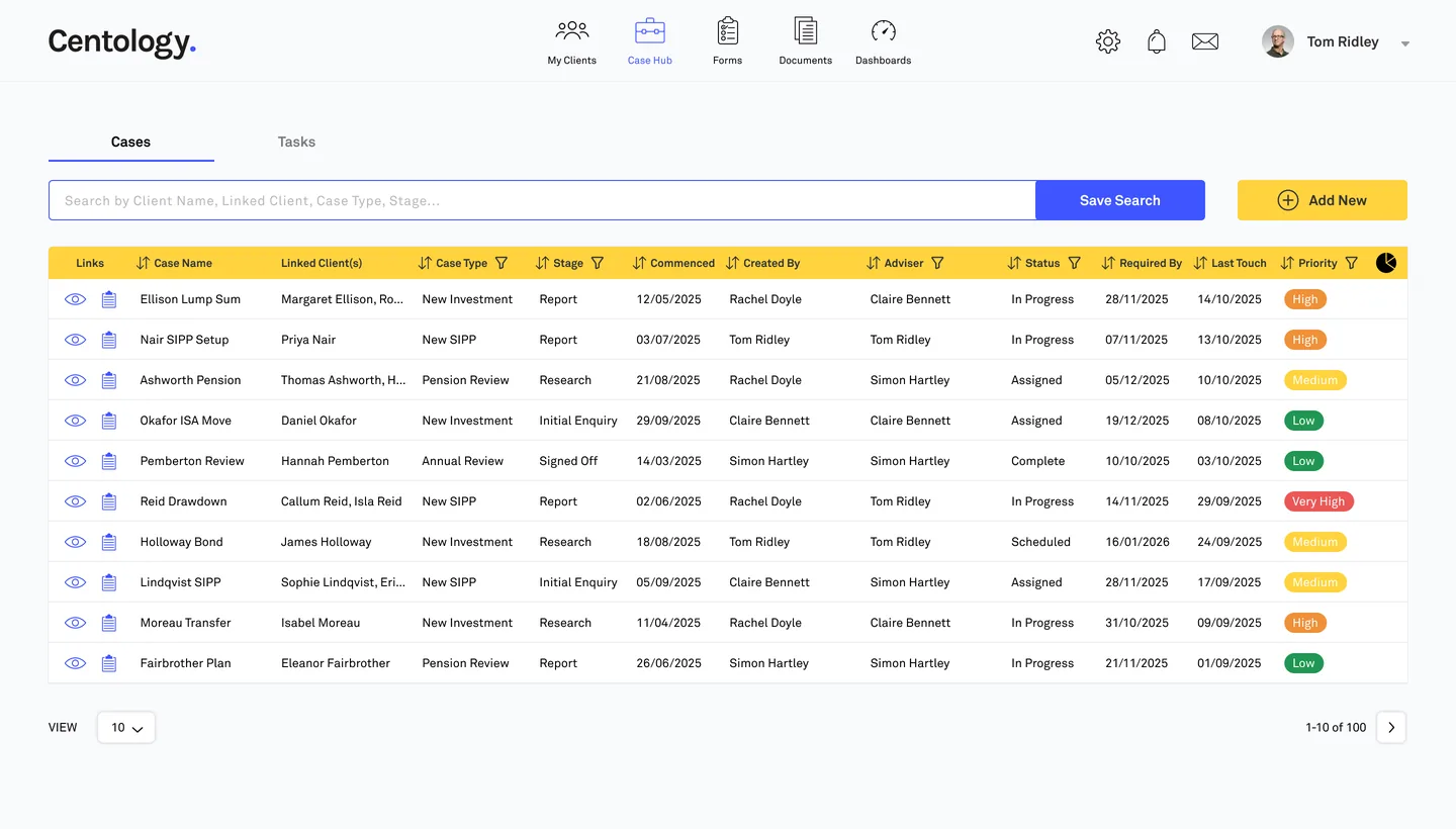
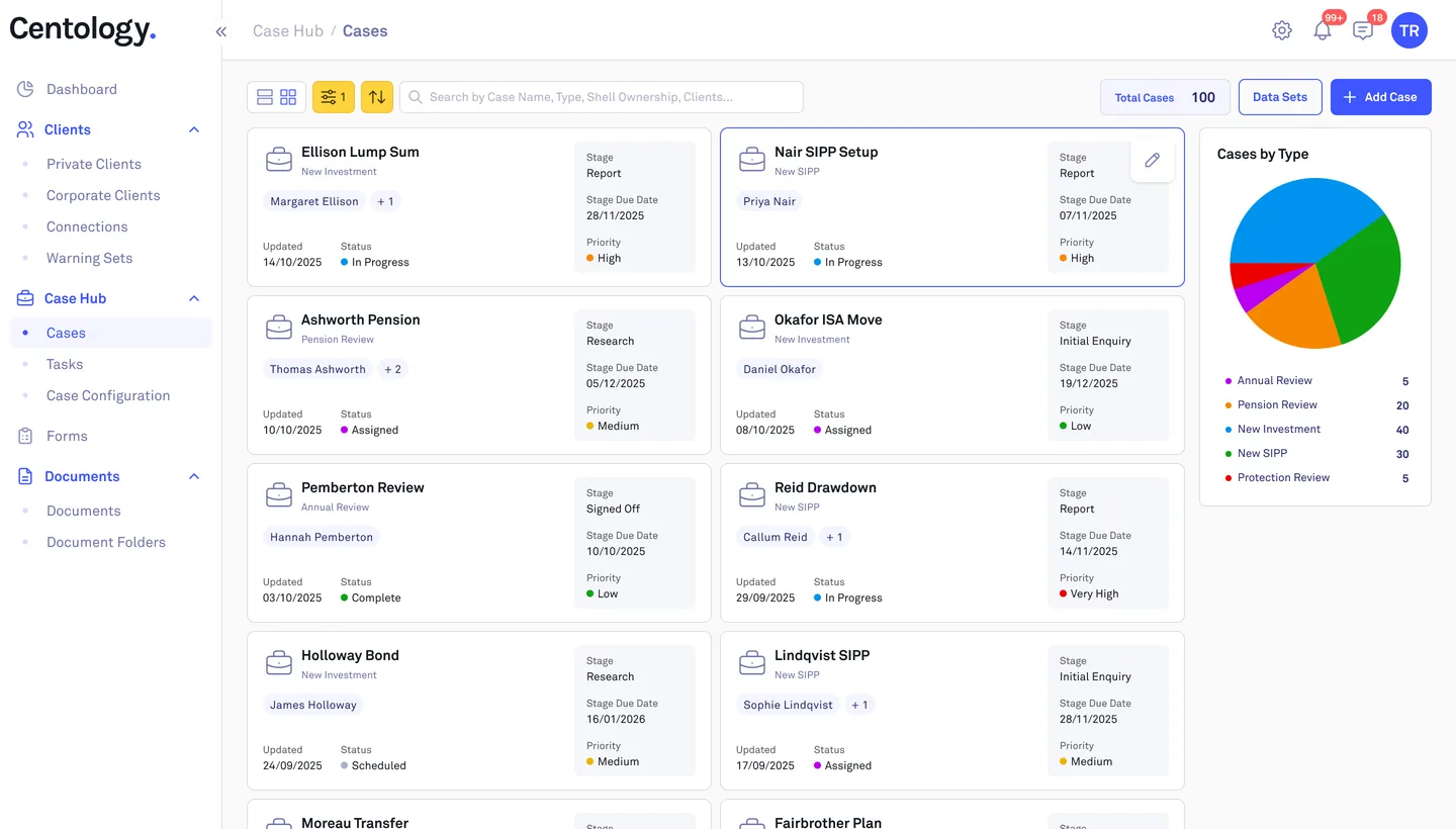
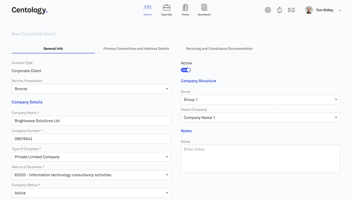
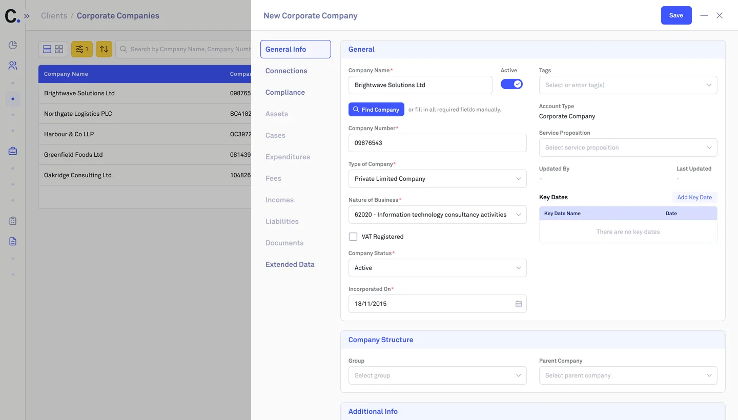
I redesigned a UK portal where financial advisers manage clients and cases, and designed the client app now on iOS and Android.

  • UX/UI Designer · sole designer
  • Centology (IFS) + 3 white labels
  • Since Dec 2024, ongoing
  • Web · iOS · Android

The brand switcher is a demo device — the real product ships one interface with four white-label themes.

TL;DR

One redesigned portal for four brands and a client app on iOS and Android

  1. A UK portal where financial advisers manage clients and their clients see finances and documents. Three firms run it under their own brands.
  2. My part: redesign and new vision of most features, the client app MVP, a design system with tokens per brand, and review of every module the developers built.
  3. The app is live on iOS and Android. 30 of 61 portal sections already run on the new design.

Context and problem

Financial advisers in the UK use Centology to run their whole client relationship: clients, cases, forms, documents and messages. Their private clients log in to see plans, assets, wills and attitude to risk. Three other firms run the same portal under their own brands.

When I joined, the portal looked dated and every section worked its own way. Screens were overloaded, roles were easy to get lost in, and grid columns shrank until you couldn't read them. White labels were recolored by hand. My audit and Centology's brief named the same problems.

An earlier redesign concept hadn't gone ahead, so the task was to modernize the portal without stopping a live product.

My role

What I did

  • As the only designer on a 13-person team, I redesigned most portal features and reworked their logic with the BA.
  • Designed the client app MVP: 25 flows, now on iOS and Android.
  • Built the design system for four brands, with guidelines written for developers and AI agents.
  • Designed AI features: a prompt manager for admins and AI plan summaries for clients and advisers.
  • Reviewed every module the developers built against the design and spec, for every role.

UX research

Before redesigning, I walked through the old portal's key flows for each role, compared how sections handled the same tasks, and checked my findings against Centology's brief. Below is one flow: an adviser creating a case.

An adviser creates a case · old portal

  1. 01 Find Cases

    Doing
    Hovers Case Hub, picks Cases
    Friction
    Cases hidden in a hover menu
    Opportunity
    Show the whole menu
  2. 02 Start a case

    Doing
    Clicks Add New in Cases
    Friction
    A new full page replaces the list
    Opportunity
    Keep the list in view
  3. 03 Add details

    Doing
    Fills in the case details
    Friction
    13 fields, then tabs of tables
    Opportunity
    Group fields into sections & tabs
  4. 04 Link records

    Doing
    Adds clients, tasks, plans, forms
    Friction
    9 tables, two kinds of Add button
    Opportunity
    One way to add anything
  5. 05 Save

    Doing
    Scrolls down to Save
    Friction
    Save at the bottom of a 2,700 px page
    Opportunity
    Keep Save in reach
  6. 06 Review and compliance

    Doing
    Opens Index, Review, Compliance
    Friction
    Tabs inside tabs, full of tables
    Opportunity
    One level of tabs in one panel
From my flow walkthrough of the old portal. Schematic screens, recreated for this case study.

How might we…

  • …let advisers create a case without leaving the list?Case Hub
  • …show the whole menu to each role at once?Navigation
  • …make every section add and edit things the same way?Records

Process

I broke each request down with the BA and drew the screens first. The BA then finished the spec based on them, and Centology reviewed every version.

  • Before: Total 34 h of 35 h required (Structured 18 h 30 m, Unstructured 15 h 30 m); Structured 18 h 30 m of 21 h (IDD 9 h, PTS 9 h 30 m). After: Total 36 h 30 m of 35 h (Structured 21 h, Unstructured 15 h 30 m); Structured 21 h of 21 h (IDD 11 h 30 m, PTS 9 h 30 m).

    On my screen, one added workshop brings Total and Structured up to the yearly requirement.
  • 4.3.9 Training & CPD · CPD Summary graph

    “It compares completed CPD hours with required CPD hours across different CPD categories.”

    “At least 60% of the 35-hour total must be “Structured” (verifiable learning with clear outcomes), the minimum annual requirement = 21 hours.”

    Spec: 35 hours in total, 21 of them structured.

Solutions

Web portal

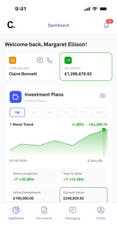
Mobile app (MVP)

Shipped

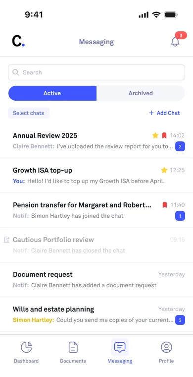
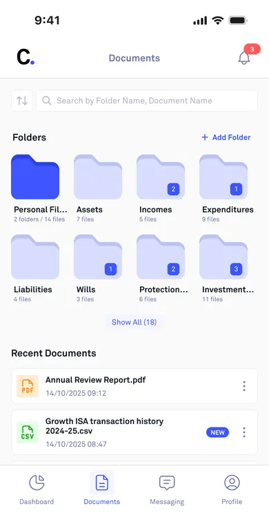
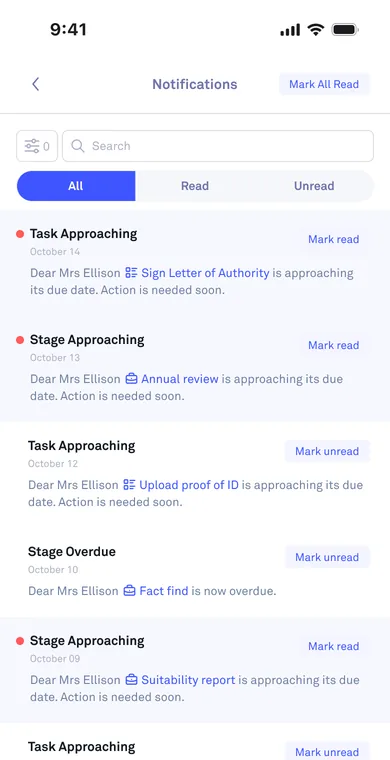
Client finances, documents and adviser chat in one app

Client app for private clients: plans, assets, incomes and expenditures, documents and secure chat with their adviser. Live on iOS and Android.

Why this way Centology chose the scope: finances, documents and chat. I brought them to the phone on the portal's design system, with mobile-only components where needed.

From design to code

Empeek's developers built the portal from my screens, design-system components with every state, and the BA's spec. After each module I checked the build against the design and spec for every role. Most mismatches were spacing, sizes and responsive layout.

  • Tokens

    I built a color mode per brand for design. Developers use the same color scale, with each brand's own values.

  • Guidelines

    Font, color, icon and status rules for developers and an AI agent, checked against the developers' data keys.

  • Implementation review

    16 modules since October 2025, checked against design and spec for every role.

Review board in Claude: front-end issues on the Cases page grouped by section, with CSS current vs expected and statuses.
The review board I built in Claude with my own skill, shared with the whole team. Mismatches are grouped by role and interface section, and developers set each item's status.

Outcome

  • ~1,100

    mismatches caught in review since Oct 2025, across 16 modules

  • 35 of 61

    portal sections redesigned, 30 already live

  • iOS + Android

    client app MVP, ~120 screens and states

What changed in the user flow

  • Records

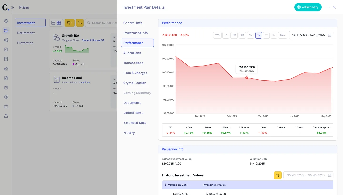
    Every record opens in the same side panel with tabs, instead of its own long page or an oversized popup.

  • Plans

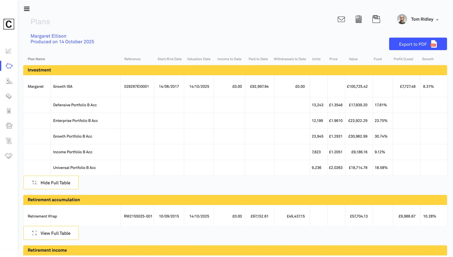
    Clients see their plan totals first and open one plan at a time, with an AI summary in plain English.

  • Navigation

    Every section sits in the sidebar, and the page path always shows where you are.

Takeaways

  • I'd build on tokens and variants from day one and agree them with developers then, instead of migrating later.
  • I'd keep frame and section names clean from the start, so an AI agent can find the right frame.

Next case

How one design system serves four brands

Four brand cards from one system: Centology, LCA, EBC and DMA, each with its own colors, button, toggle and checkbox

Centology: design system

One system for four brands: Centology and three white labels with their own colors and logos. Guidelines for developers and AI agents.

  • Design system
  • White label
  • Fintech

My contribution

System and guidelines · Styles for 3 white labels

Open case

Contact

Working on a portal or a CRM?

Tell me about the task.