Work

Revive: telehealth CRM redesign

I redesigned a US telehealth CRM for behavioral health, from the call center queue to provider consults, on desktop and mobile.

  • UX/UI Designer · sole designer
  • Revive Telehealth (US)
  • Oct 2023 – May 2024
  • Responsive web

TL;DR

A telehealth CRM for four roles, redesigned for desktop and mobile

  1. A web CRM for a US telehealth company that runs psychiatric consults 24/7. Call center operators, providers, admins and billing work in it.
  2. My part, as the only designer: the redesign, responsive versions of every section, a UI kit and annotations for developers.
  3. The new design isn't built yet. Empeek names implementing it as the next step.

Context and problem

Revive Telehealth is a US behavioral-health company that runs telemedicine consults 24/7 for urgent psychiatric cases. Its web CRM takes each consult from the call center to a provider: operators queue requests, providers start and close consults, admins manage users, facilities and diagnoses, and billing pulls reports.

Empeek took on the product to extend it, and one goal was a new design version. I joined in October 2023 as the only designer and went through the existing CRM in walkthroughs.

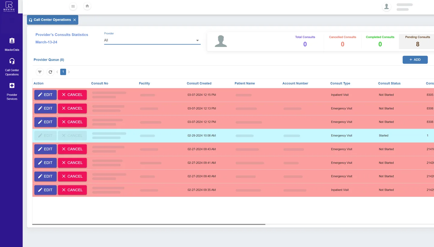
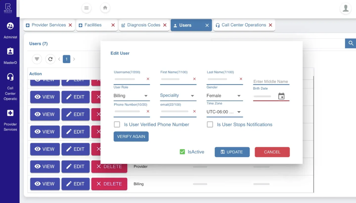
Every section looked different, tables ran wider than the screen with a search icon in each header, and rows carried big action buttons. The CRM also had to work in mobile browsers, but on a phone it was the desktop layout squeezed.

My role

What I did

  • As the only designer on Empeek's team of six, I redesigned every section of the CRM for its four roles.
  • Designed responsive versions for mobile browsers, adapted for touch rather than shrunk.
  • Built a UI kit (17 sets, ~120 variants) for 80+ desktop screens and states.
  • Annotated screens for developers: hover, states and behavior.
  • Worked from the BA's spec, proposed changes and flagged a conflict; the BA updated the spec.

UX research

Before redesigning, I went through the existing CRM in walkthroughs and asked QA how each section worked. Below is the core flow: a consult moving from the call center to a provider.

A consult moves from the call center to a provider · existing CRM

  1. 01 · Operator Create the consult

    Doing
    Picks a provider, adds the patient
    Friction
    Ten fields always open above the queue; provider picked in a separate dropdown
    Opportunity
    Add a consult in one modal
  2. 02 · Operator Track the wait

    Doing
    Scans the queue for long waits
    Friction
    Raw minutes in a queue wider than the screen
    Opportunity
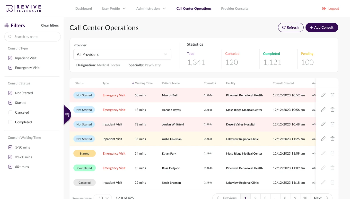
    Three waiting ranges, three colors
  3. 03 · Provider Take it on

    Doing
    Gets an SMS about the new consult, checks in or passes it on
    Friction
    A big Reassign button on every row
    Opportunity
    Check In toggle first; Reassign only while not started
  4. 04 · Provider Start the consult

    Doing
    Opens the consult, presses Start
    Friction
    Patient details as one long list of labels
    Opportunity
    Patient and consult info in two blocks
  5. 05 · Provider Record the outcome

    Doing
    Adds codes, disposition, remarks; ends
    Friction
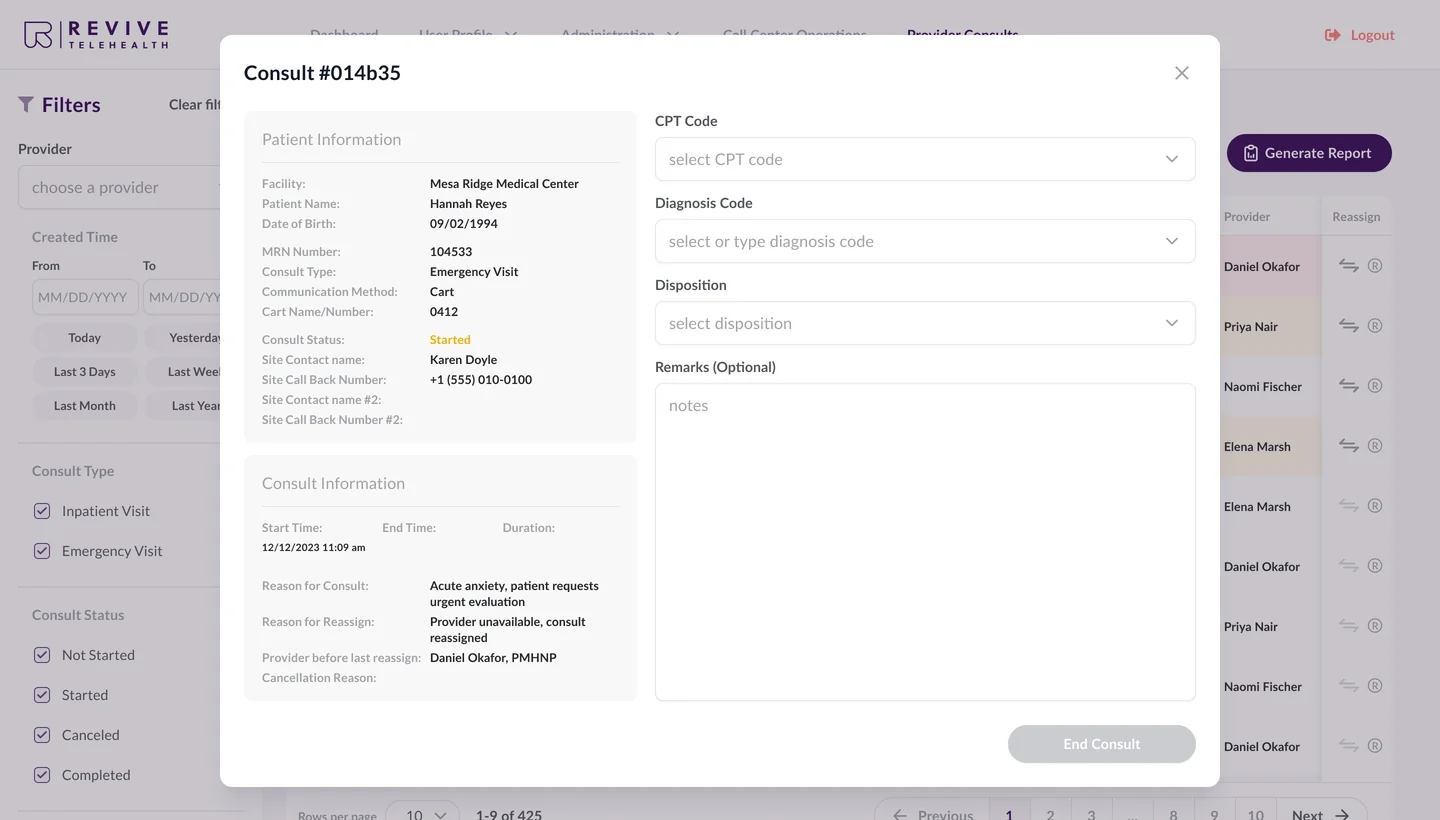
    Codes wrap to 3–4 lines; cancel fields on every consult
    Opportunity
    Only the fields this step needs
From walkthroughs and QA screenshots of the existing CRM (2023–2024). Schematic screens, recreated for this case study.

How might we…

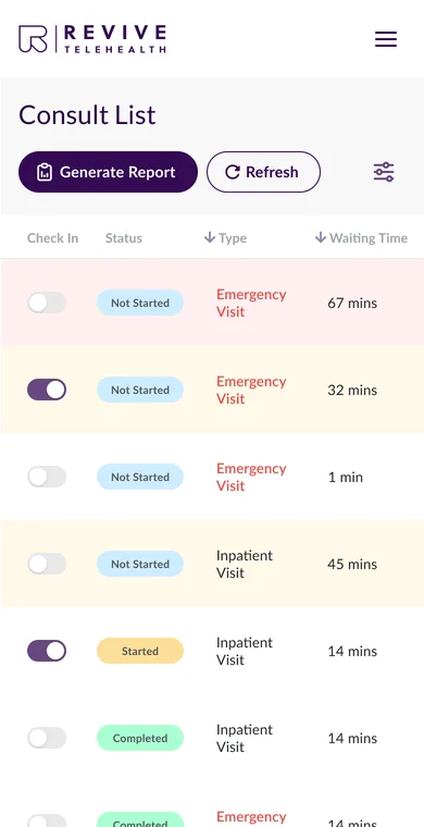
  • …let operators spot consults waiting over 30 minutes at a glance?Call center queue
  • …keep the key details of an 18-column queue always in view?Tables
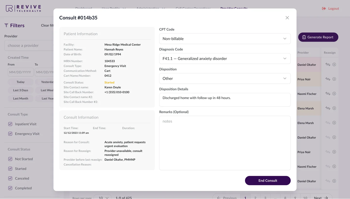
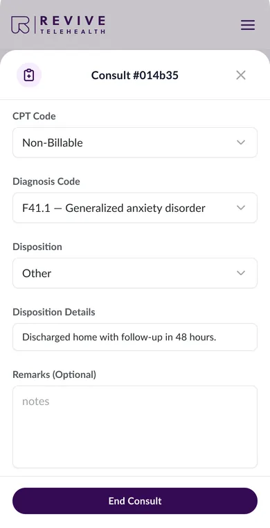
  • …guide a provider through the consult so the record fills in along the way?Consult Details

Process

I designed from the BA's spec and worked through it with the BA and QA: I pointed out issues, suggested improvements, and the BA updated the spec.

  • RT 7.4.2.4

    Provider filter: “All Providers” is selected by default.

    RT 7.4.2.5 removed

    If no provider is selected, the queue is empty with the hint “Choose a provider to see the provider’s queue.”

    Two requirements that couldn't both hold. I flagged the conflict, and the BA removed one from the spec.
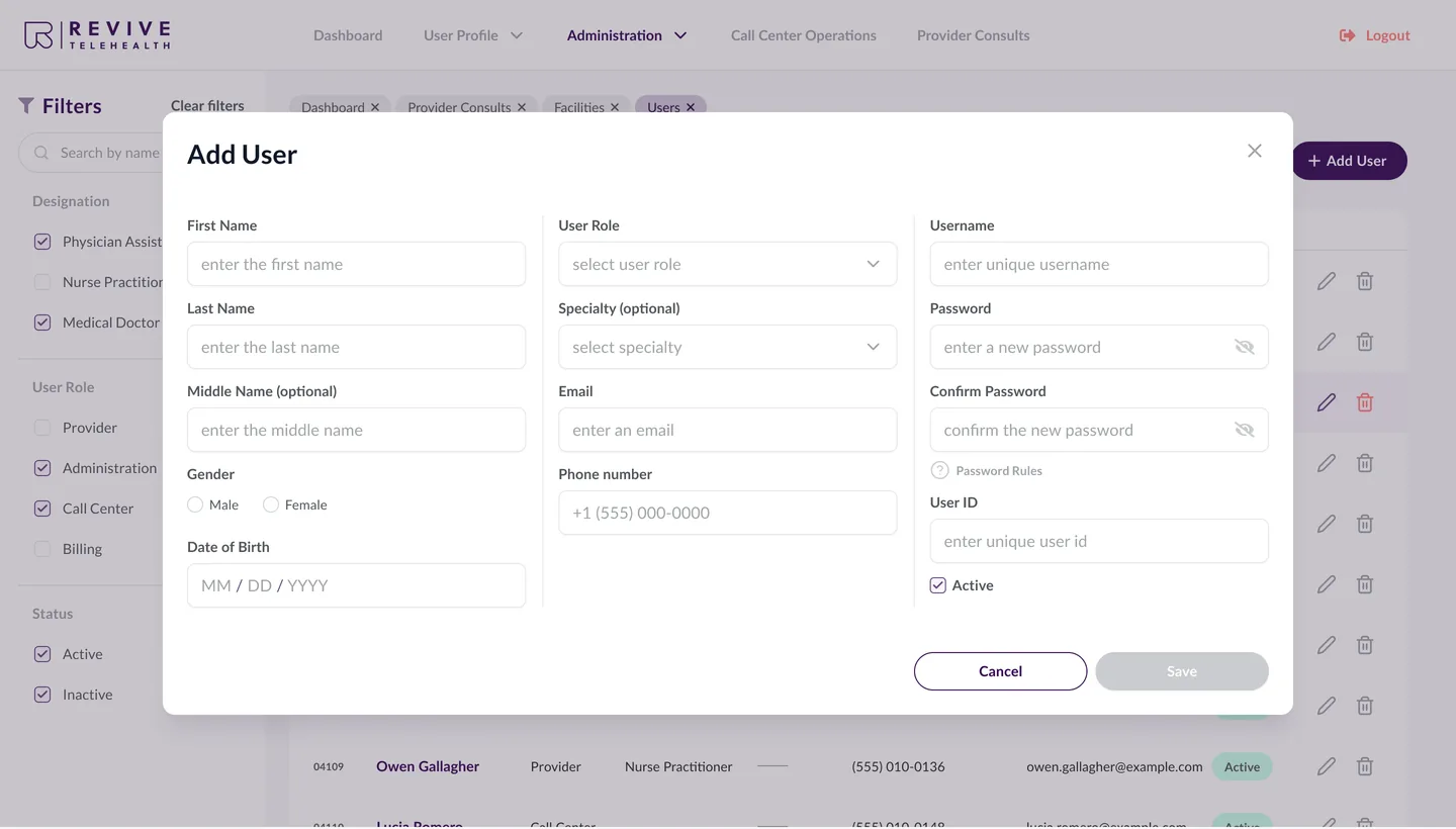
  • Three Add User layouts I put to the team. We chose grouped columns: simple to build, easy to scan.

Solutions

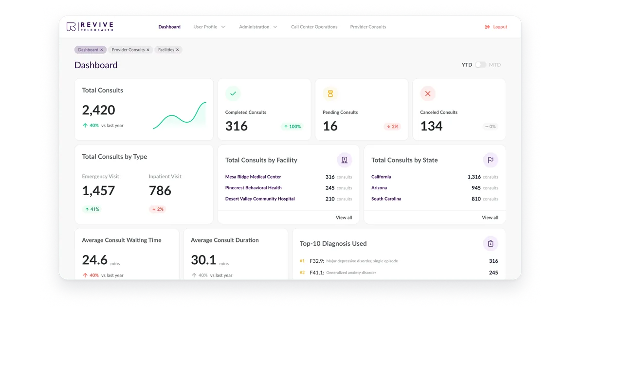
Web CRM

Responsive web

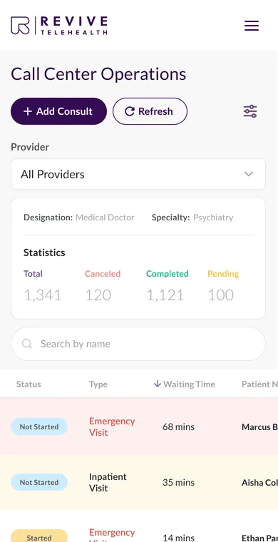
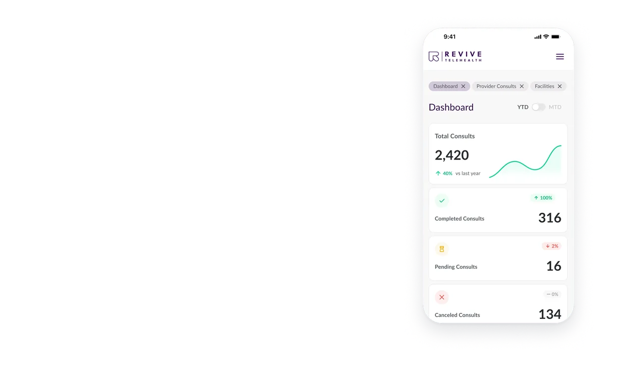
The whole CRM in a mobile browser, designed for touch

I designed a 390 px version of the CRM for touch, from login to consult details.

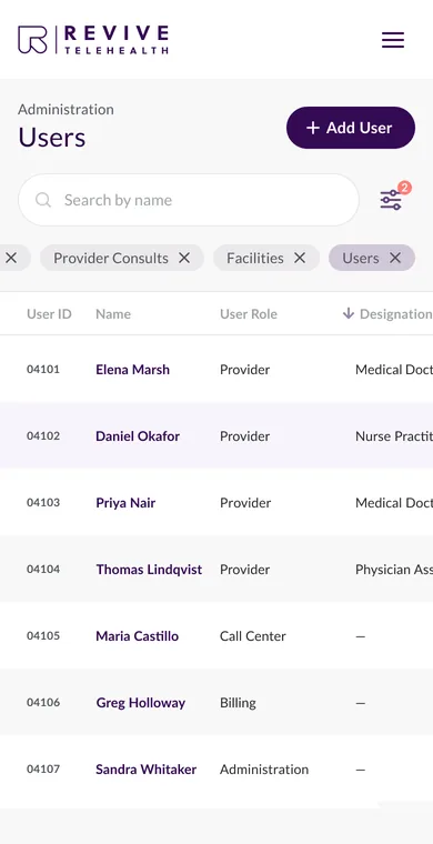
Why this way On mobile, rows don't carry buttons, and in Users a tap on a row opens edit and delete.

Handoff to developers

I prepared the redesign for Empeek's developers: hi-fi screens for desktop and mobile, a UI kit with each component's variants, and notes on the screens about hover, states and behavior.

  • UI kit

    17 component sets and about 120 variants: buttons, inputs, filters, table headers, badges and pagination.

  • Annotations

    Notes on the screens: what reacts to hover, and what changes when a filter is set.

  • Responsive specs

    A 390 px version of every section, with touch behavior noted for developers.

The Users screen of the redesigned CRM with a table row and its edit and delete icons outlined and tagged 01 and 02, the notes for developers (on a phone, one table row tagged 01).
  • Displays hover effect when it's not clickable

  • Displays hover effect when it's clickable

  • User can edit or delete another user by tapping on the table line.

Notes on the Users screen tell developers which parts show a hover effect and which of them are clickable. A note on the mobile Users screen tells developers what a tap on a table row does.

Outcome

  • 80+

    desktop screens and states

  • 17

    UI kit component sets, ~120 variants

  • 4

    roles in one CRM, each with its own access

What the new design brings to the CRM

  • System

    Every section is designed from one UI kit, so tables, filters and forms look and behave the same across the CRM.

  • Tables

    Wide tables show what matters: key columns stay pinned, row actions shrink to icons, and filters slide out when needed.

  • Mobile

    Every section has a mobile version, so the CRM is designed to fit a phone browser.

  • Urgency

    The queue shows who has waited too long, and End Consult unlocks only when the record is complete.

Next case

A portal for UK financial advisers and their clients

Centology portal Investment Plans screen with the client app Dashboard on a phone

Centology: web portal and mobile app

I redesigned a UK portal where financial advisers manage clients and cases, and designed the client app now on iOS and Android.

  • Fintech
  • B2B portal
  • CRM

My contribution

Sole designer: portal and feature redesign · App MVP · Implementation review

Open case

Contact

Working on a portal or a CRM?

Tell me about the task.